Waaahh! Next week already we should be on the way. Toulouse is the destination. France. And we are in charge of the exhibition booth. Now, five minutes before departure, project brochures are to be printed. So in this Reading List, we’ll look into the question of whether and how it still makes sense to create flyers and brochures.
Please take with you: Flyers for eternity
The success of the Internet could be seen as having replaced a wide variety of print media over the past few decades. On social media, customers can be approached, informed, and acquired quite easily. At least that’s true for those hip industries that flood our social media feeds: Morning Routine, Home Improvement, Crypto, and Travel. Brochures and flyers that also have a higher environmental footprint ‒ do we still need that?
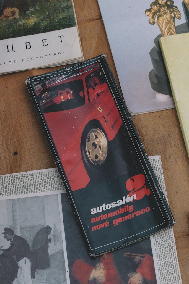
Topics that are less lifestyle-oriented or that are sensitive in their content have a much more difficult time in affirmative social media environments dominated by visual content. An application to participate in cancer studies would be an example of this. Or projects that address energy poverty (e.g. EnergyMeasures). Highly specialized audiences also continue to be receptive to analog formats such as brochures and flyers. However, both types of print have real advantages. In this context, the print format of flyers and brochures has concrete advantages. In Forbes magazine in “Paper Beats Digital In Many Ways, According to Neuroscience,” Roger Dooley argues that print formats with little text increase brand recognition much more sustainably than digital counterparts.
As with any communication product, success with brochures and flyers depends on target-group-optimized content, format, and call to action. Special attention should be paid to interoperability. On her blog, author and writing coach Annika Lamer (in German only) elaborates that flyers and brochures act in tandem with websites: namely, in most cases, the interaction that follows the flyer takes place online. Flyers and brochures are a bridge to the website or, even better, a tailored offer on their website.
Giving structure to brochures: from handouts to folded flyers to squares
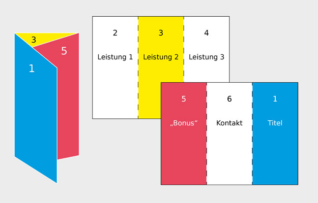
When developing the flyer, we do not classically start with the text. We start with the structure. Actually, we start with layout and structure, and text. All together. First, they determine the rough scope, then choose the format, and then design the text. Each page in the flyer gets a topic. Proposal for three folds with six pages: a title page, a contact page, three pages for three contents, and one page for extra content. No theme gets two pages. Consistency is key. The very descriptive graphic about this, given here, can be found in Annika Lamer’s blog post.
The texts themselves should be short. Short does not mean that everything should be shortened. It means that you limit yourself and present only the most popular or exceptional of their achievements and results. We have written about the importance of brevity in a previous post. You got 8 seconds only!
Things that must be included in the flyer? Logo, publisher (incl. web address), texts structured by crisp headlines and subheadings, images (and or infographics). If you have any, do not forget seals, sponsors, or references, e.g. of legal nature. We reached the design.
Brochure design: from content to images to infographics
Moving on from the target group to the general design. Many people skim-read and discard flyers or brochures in one motion. Flyers and brochures that work with loads of text and photographs disappear even faster in the trash can than brochures with schematic infographics. This is at least, what Terabe et al. argue for in “The Impact of Flyer with Infographics on Public Awareness and Interest to Transportation Project.” Picture Superiority has been around for a long time ‒ we could write about Infographics Superiority in the next Reading List. An exciting topic.
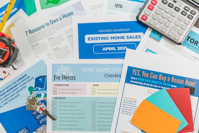
Good examples and hands-on instructions for creating your brochures and flyers, with and without infographics, abound. At OIKOPLUS, we like to get inspiration, especially when things need to be done quickly. For example, Canva or Envato. For projects and events in the field of art and culture, Visme offers great inspiration. That’s probably how we’ll do it for the next one of our brochures. Fortunately, a week is longer than 5 minutes.
